The xG Model
Expected goals (xG) is the senior analytic measure for football right now. A mathematical model is built that learns the success rate of shots at goal. That model is then used to measure the value of shots during a game. A good explanation can be found here on BBC.
My model
I've built an xG model using Machine Learning and a fairly diverse set of features. The data used to teach the model, and then verify it, has been sourced from two large, free datasets:
There are a total of 2500 games in the sample set. 80% of that data was used to train the model and 20% was used to validate it. Further manual validation was done against the 2019 CPL season data and the summary xG values available from Opta by way of Canadian Premier League Center Circle Data.
Because I was working with 3 different data formats (Statsbomb, Wyscout and Opta) I needed to establish the lowest common denominator of information that could be extract from each source. For that I used the SPADL data format established by Tim Decroos, Jan Van Haaren, Lotte Bransen and Jesse Davis (PDF). Because of this there were a number of dataset features that I was unable to make use of. For example, Statsbomb's Freeze Frame which outlines the positions of all players on the pitch when a shot is taken could be interesting data for an xG model but only a fraction of the data being used had this included in it.
Having never seen the CPL shot data during training and validation, the final model was applied to this data and predicted the 2019 season goal total as -0.05 compared to the total goals scored. As comparison, the Opta data predicted +49 compared to the total goals scored. This definitely doesn't mean that my xG model is better than Opta's model. It just happened to perform better on the CPL data.
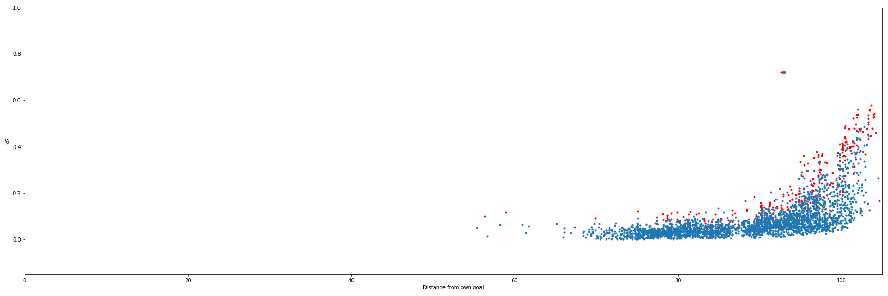
Further verification I did an eye test of the CPL shots in two manners. First I checked to see that there was a reasonable rise in xG value as shots got closer to the target goal. The scatter plot seems to reasonably increase in value as the goal on the right is nearer. There's a reasonable smattering of goals at lower xG levels with most coming from higher value shots closer to the net. There is a cluster of outliers that represent the penalty shots which I have assigned a fixed xG value of 0.72 based on the simple math of (number of penalties scored)/(number of penalties taken) through 100% of the training and validation data.
I also verified that the scatter plot for shots looked reasonable when observed from behind the target net. It appears that as you move farther to the left or right of the net-center-line the xG value decreases, as do the number of successful shots. The shots directly in front of the net have the highest number of resulting goals and the higher xG values.
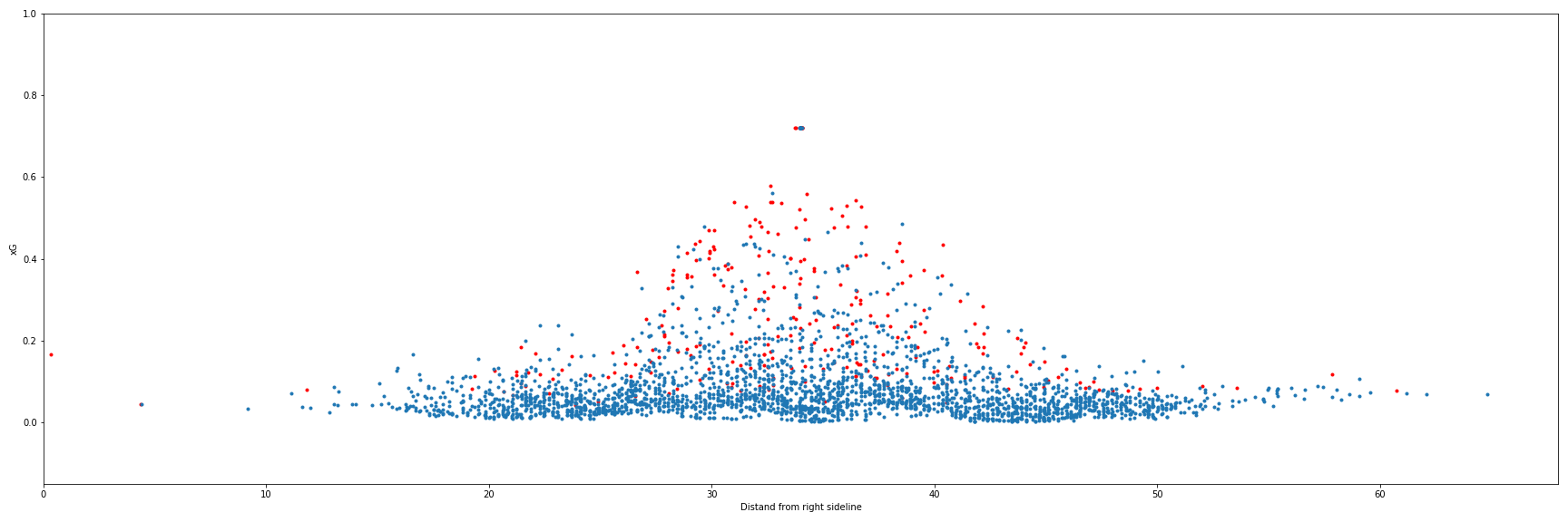
There are definitely some problems with the model. For example, in the above image you can see a goal was scored from the far left of the net. This was a corner kick that went directly into the net. It shows here as having an xG of nearly 0.2 which is absurdly high for that type of shot. There's no way nearly 20% of all corner kicks that are shots go in. If that were the case we'd see a lot more of them attempted.
Why do anomalies like these exist? It could be a few different things, but the first that come to my mind are that the sample set might be too small. Another one that I'd like to investigate is if having to work with the lowest common denominator across three disparate data sets is a factor. Perhaps using one data source would allow for more insightful features to be developed and worked into the model training.
Overall, the model works for what I need at this point in time. It's not perfect, the imperfections are not going to make it completely useless for the work I'm doing.